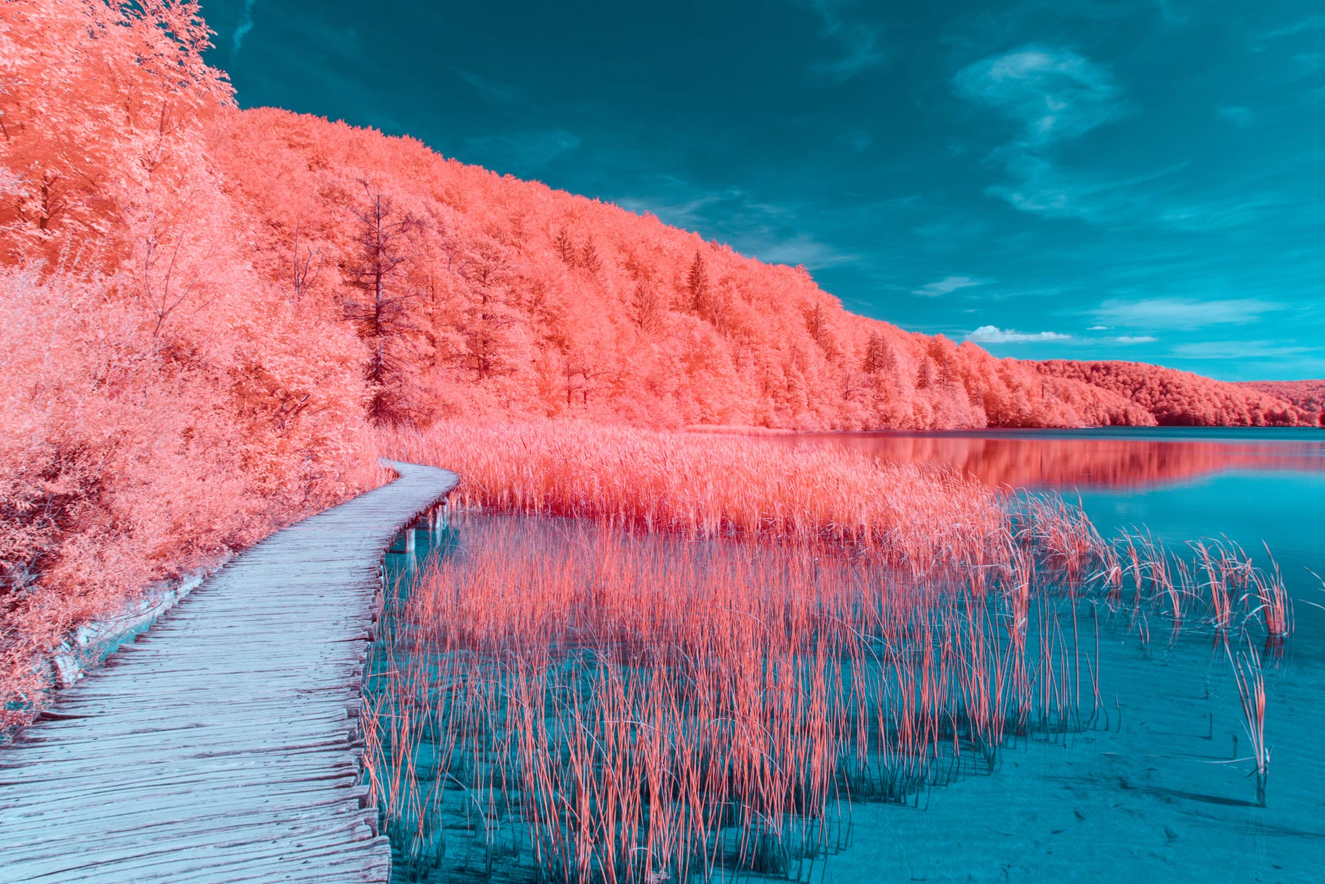
With a recent IPCC Report predicting the world is on-track to lose 99% of its coral, reef health has once again been thrust to the forefront of global consciousness. Now the Pantone Institute, one of the most influential fashion and beauty trend forecasters, is capitalising on that momentum with the announcement of its 2019 Colour of the Year.
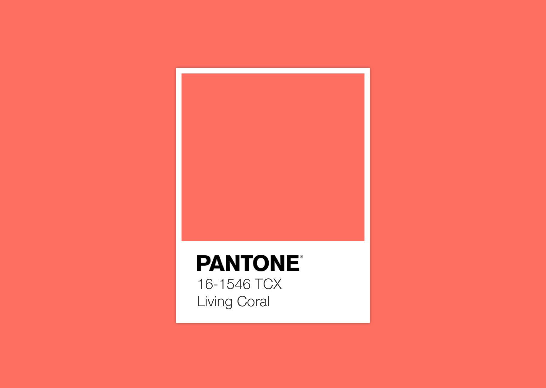
‘Living Coral’ is Pantone’s hue of choice – a not-so-subtle reference to the state of our reefs and hint at where our attention should be focused. Described as a ‘nourishing shade’ with gold undertones, Living Coral evokes nature’s kaleidoscope while raising some uncomfortable questions. In its official statement, the Pantone Institute said of Living Coral: “We get energy from nature. Just as coral reefs are a source of sustenance and shelter to sea life, vibrant yet mellow Living Coral embraces us with warmth and nourishment to provide comfort and buoyancy in our continually shifting environment.”
Living Coral is drawn directly from nature’s palette. In 2019, which is already shaping up to be a pivotal year for climate change, this is no coincidence. Shades like Living Coral are becoming more and more elusive – a visual reminder of how climate change irreparably alters our ecosystems. It poses a rather difficult hypothetical: Will there come a time when shades like Living Coral disappear from nature all together? Are we destined for a future where life-affirming tones must be mixed from chemical compounds in laboratories?
An Australian creative duo responded to Living Coral with a guerrilla art campaign that calls for ‘Bleached Coral’ be named Colour of the Year 2020
The Pantone Colour of the Year is selected annually by a panel of colour experts. Their choice is a harbinger of trends to come, and already we’re seeing Living Coral filter down into fashion, home furnishings, product design and cosmetics. The reception has been warm overall, with most embracing the shade and its deeper meaning. Others have criticised Pantone’s decision as distasteful. Jack + Huei, an Australian creative duo, responded to Living Coral with a guerrilla art campaign that calls for ‘Bleached Coral’ be named Colour of the Year 2020. The glum and uninspiring shade of off-white is a stark reminder of what’s install if we don’t get our act together.
When National Geographic named 2018 ‘The International Year of the Reef’, many believed meaningful change was on the way. However, despite increased research and awareness, reef health continues to deteriorate, with coral die-off now at an all-time high. One-fifth of all ocean coral has been destroyed; more than 50% of the Great Barrier Reef alone has already been lost. If predictions hold true, only 1% of the world’s coral will survive a temperature rise of 2 degrees.
Finding imaginative ways to engage people on climate change has never been more important. Of course it isn’t the first time we’ve seen marine health infiltrate the fashion and beauty world. In 2017, Adidas sold one million pairs of sneakers made from upcycled plastic waste salvaged from the world’s oceans. Exposing the harmful impact of micro-beads has prompted many countries to consider banning the cosmetic additive. The UK was the first nation to follow through. Meanwhile, fabric innovations such as Econyl – luxe yarn generated from recycled nylon fishing nets – have been embraced by the likes of Gucci and other fashion powerhouses.
Searches for ‘sustainable fashion’ surged to an all-time high at the end of 2018 and are only expected to grow
Pantone’s colour selection fits in with broader predictions for 2019. According to data from Pinterest, searches for the term ‘sustainable fashion’ skyrocketed by 34 percent in 2018. This has led many publications and influencers to name sustainable fashion as one of the top industry trends for the coming 12 months. On Google, too, searches for ‘sustainable fashion’ surged to an all-time high at the end of 2018 and are only expected to grow.
As we grapple with climate change and look for a way out from one of the darkest chapters in human history, we could do with some uplifting. Living Coral as a colour is enriching and inspiring; it embodies optimism and joy. According to Pantone, it corresponds to humankind’s search for connections and intimacy in a shifting climate. Living Coral is about looking forward, not back.
The impact of Pantone’s decision to name Living Coral its Colour of the Year 2019 remains to be seen. At the very least, we can be sure it’s going to colour more conversations and purchasing decisions with a thought for the reef – and that can only be a good thing.
WORDS: EMILY LUSH

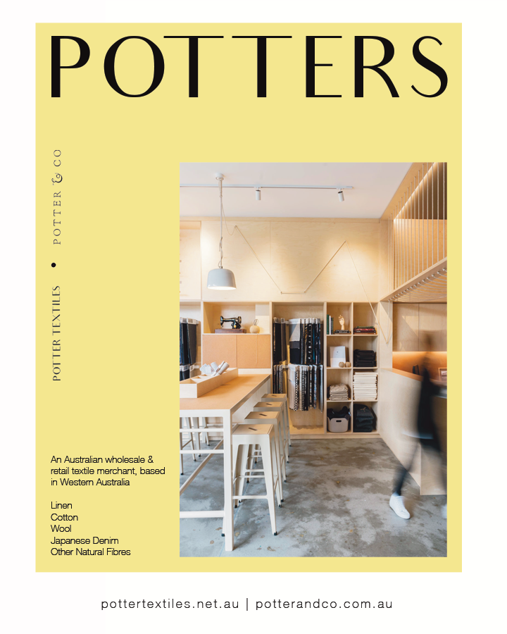


“My piece of advice for makers and designers? Run your own race… make sure your key decisions stay anchored in your brand’s core beliefs.”
- Bec Bligh
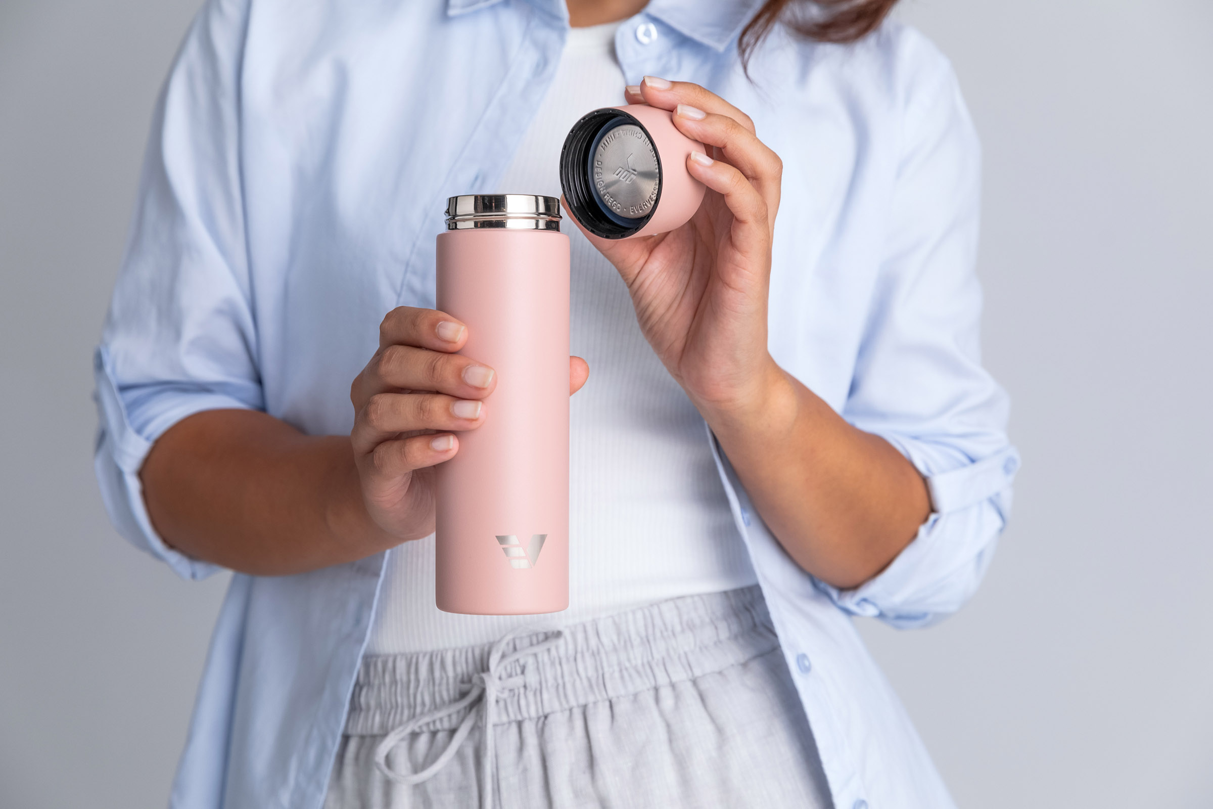
Quick show of hands: who’s opened a water bottle expecting a refreshing sip… and instead been greeted by the unmistakable whiff of uh-oh?
Because for something that follows us everywhere (desk, car, hikes, yoga…), the humble drink bottle is strangely prone to becoming a science experiment. Hard-to-clean corners and gaskets. Mystery smells. Bec Bligh and her husband Tim know it well. A six-month sailing trip along the Queensland coast left them with a lifetime of memories and one stubborn annoyance: mouldy water bottles they couldn’t properly clean.
So they did something about it.
Enter @EverVessel. Thoughtfully designed borosilicate glass and stainless steel bottles that keep things beautifully simple: durable materials, wide openings, easy-to-clean parts and none of the techy gimmicks that tend to age badly. Turns out simplicity, done well, is pretty powerful stuff. (Their many design awards agree!)
And lately they’ve added a little extra delight: the Artist Series, where creatives like Paola Castro, Ben Miners and Martin Thompson transform these everyday companions into tiny travelling artworks. There are more colabs in the works, too: hydration, but make it joyful! 🎨💧
We chatted with Bec about the sailing trip that started it all, the philosophy behind Ever Vessel, and why the most sustainable product is often just the one you keep using.
Tap the link in our bio to read the full conversation. 🚰
#EverVessel #ReusableWaterBottle

Pull up a chair… there’s room at this table!
For the first time, Feast for Freedom is bringing people together for a spectacular long-table dinner as part of the Melbourne Food & Wine Festival.
A Longer Table is exactly what it sounds like: one beautiful shared table inside the Asylum Seeker Resource Centre (@Asrc1), piled with generous dishes inspired by this year’s hero cooks, Noha and Nige.
From 6 to 9pm on Wednesday, 25 March, this is what you can expect:
🍽 A three-course shared feast
🍷 Matched drinks
🎶 Live entertainment
✨ A room full of good humans
Your ticket doesn’t just buy you a delicious dinner. It supports the ASRC’s vital work and helps create a fairer future for people seeking asylum.
Seats are limited, and long tables have a way of filling up quickly – head to @MelbFoodAndWine’s website to book now: feastforfreedom.org.au/mfwf
#FeastForFreedom #MelbourneFoodAndWineFestival #LongTableDinner #FoodForChange
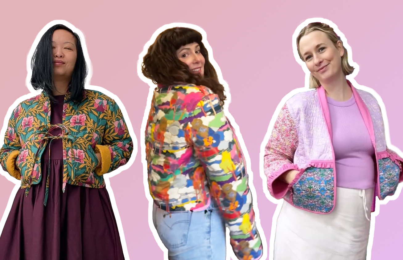
Sew versatile! 🪡
Another great make from Lisa from @SunnySewsEveryday:
My #PeppermintWaratahWrapDress is finished and I’m so proud of it. It has been designed not to flap open and flash your pants in the wind, so I feel confident it will be a great wheelchair or standing dress in English weather.
#PeppermintPatterns #WrapDress #WrapDressPattern
Frame your face with the Peppermint Bucket Hat!
Stay safe and stylish in the sun with your very own self-sewn and self-drafted wide-brimmed bucket hat. This beginner-friendly sew is perfect for a sunny day. Get out your pencils – this pattern is created using equations and maths!
This DIY project was featured in Issue 53 and now you can access it for the lovely low price of only $5.
Sun-safe chic is always in style. ☀️
Find it via the link in our bio!
Photos: @KelleySheenan
#PeppermintPatterns #PeppermintBucketHat #BucketHat #BucketHatPattern #DIY
✨ INSTANT CLASSIC ✨
The Peppermint Myrtle Shift Dress is a beginner-friendly make with a few special details based on the ever-stylish shift shape – the perfect dress you need in your wardrobe right now!
Myrtle cuts above the knee with options to customise the length. Don’t think she’s reserved for hot weather either: try a heavier-weight fabric to turn your Myrtle into a pinafore-style garment for layering.
For our fabrics we chose two from our lovely sewing partner @Karmme_Apparel – the bold Rottnest Stripes in a lightweight, soft-drape cotton, and the quality linen in the handpainted Mexico Collection.
Get making the Myrtle – the only question is, can you stop at just one?
Link in bio 🪡
Fabric: @Karmme_Apparel
Sewist: @Laura_The_Maker
Photos: @KelleySheenan
Models: @SerahSews and @Pins_And_Tonic
Location: @ShareTheDignityAustralia
#PeppermintMyrtleShiftDress #PeppermintPatterns
It’s time to Feast!
Some recipes travel a long way before they land on your table to delight your taste buds. This year’s Feast for Freedom invites us to gather our friends, cook something delectable and raise funds for the incredible work of the Asylum Seeker Resource Centre (@Asrc1) while we’re at it.
The 2026 Feast features recipes shared by two remarkable cooks: Noha, who brought the flavours of Palestine with her when she arrived in Australia, and Nige, a Sri-Lankan Tamil cook whose journey with food began in the most unexpected of places.
You can host your own Feast up until 30 April – simply register online and get planning! Host a dinner, organise a workplace lunch, or gather your community… However you do it, the idea is simple: cook, connect and celebrate the cultures and stories that shape Australia.
Want to find out more? Head to the link in bio to meet Noha and Nige, learn more about their stories, and discover a delicious recipe to try.
#FeastForFreedom #PeppermintMagazine #FoodForGood #ASRC